Walls That Tell Tiny Stories

Today we’re diving into vertical stamp display systems for studio apartments, turning limited square footage into soaring narratives of paper, ink, and travel. Expect conservation-smart materials, renter-friendly hardware, light management, modular layouts, and design strategies that honor miniature masterpieces while preserving calm, breathable living space. We’ll mix practical steps with real collector stories, so you can adapt ideas, rotate exhibits without clutter, and build a wall that invites conversation, reflection, and delightful, close-up discovery every single day.

Space-Savvy Foundations

In a studio, every surface has a second job. A vertical system must respect pathways, furniture clearances, and visual calm. Begin by mapping existing sightlines, measuring reachable heights, and locating studs or safe mounting zones. Then plan a grid that suits your collection’s size diversity, leaving breathing space. If you rent, prioritize reversible methods and gently distributed loads. The goal is a wall that feels weightless, organized, and welcoming, even beside a sofa, desk, or fold-out bed.

Archival Safety Comes First

A breathtaking wall means nothing if paper suffers. Prioritize acid-free mats, lignin-free backings, and inert polyester sleeves that cradle hinges without clouding inks. UV-filtering acrylic reduces weight and glare compared to glass, crucial in small rooms. Manage humidity, avoid heat sources, and allow airflow behind frames. Use reversible hinges and archival corners for delicate pieces. Your goal is an elegant, breathable home for stamps that survivors of oceans and borders deserve, now and decades ahead.

Modular Systems and Layouts

Modularity is the small-home superpower. Rails, magnetic boards, and shallow shadow boxes adapt as collections grow or change focus. Keep components slim, repeat visual rhythms, and build pathways for rotation without ladder acrobatics. Standardize sizes so mats and frames interchange quickly. Mix permanent anchors with movable hooks to refine layouts across seasons or new acquisitions. A modular backbone invites experimentation, allowing you to tell fresh stories without rebuilding the wall or disturbing your peaceful routine.

Designing Narratives on the Wall

Chronologies That Flow Upward

Stack time from baseboard to ceiling: earliest issues near the floor, modern releases above. This gentle ascent feels aspirational in a compact room, pulling the gaze skyward. Use small date tabs or color-coded corners to clarify transitions. Allow small gaps where wars, reforms, or innovations shift the postal world. The vertical journey becomes biographical, encouraging slow viewing and rewarding repeat visits with fresh connections between tiny images and sweeping global events.

Color and Texture Harmonies

Let mat tones echo your rug, throw blanket, or cabinet fronts, weaving the display into domestic life. Group warm-red cancellations beside brass fixtures, while cool blues align with concrete or steel accents. Subtle linen-textured mats add calm without stealing attention. Maintain a limited palette for coherence, sprinkling vivid outliers as exclamation points. When palette, texture, and stamp imagery converse, even a narrow column becomes an intentional, uplifting accent rather than visual clutter.

Micro-Labels, Macro-Meaning

Tiny captions do heavy lifting in small homes. Use concise type, high legibility, and archival, removable adhesive. Focus on dates, origins, designers, and quirky anecdotes—ship delays, misprints, or celebrated mail routes. Consider QR codes that link to deeper stories without crowding the wall. Keep labels visually subordinate to stamps, yet inviting to curious visitors. Thoughtful labeling transforms a beautiful arrangement into a learning pathway that grows richer with every rotation and new find.

Lighting Without Damage

Light sculpts your vertical gallery, yet the wrong spectrum can bite. Seek LED tracks with adjustable heads, high CRI, and minimal UV. Position beams to graze surfaces, controlling reflections on acrylic. Add dimmers for evening softness and bright daytime clarity. Blackout curtains or films guard against sunbursts. Test angles with a phone camera to spot glare before committing. Responsible lighting lets colors sing, keeps paper safe, and flatters small rooms after sunset.
Mount a short, ceiling-mounted track parallel to the display and aim fixtures at thirty to forty-five degrees to cut glare. Choose narrow beams for single frames and wider beams for clusters. Keep wattage modest and use consistent color temperature for calm. Dim during movie nights, brighten for browsing, and avoid spot hot-spots on delicate series. Adjustable tracks evolve as your layout changes, minimizing patchwork while delivering museum-like clarity in a modest footprint.
Embed low-heat LED strips beneath shelf lips to create gentle, shadow-free illumination. Select a high color-rendering index to faithfully reveal inks and papers. Use diffusers to soften hotspots and cable management to maintain serenity. Battery-powered options simplify renter setups, though wired systems feel seamless. Pair smart plugs with schedules so light greets you at dusk. Discreet illumination adds depth, sculpting a sense of architecture without crowding furniture or overwhelming intimate nighttime routines.
Natural light is uplifting, but patience protects pigments. Install UV-filtering films on bright windows and practice curtain choreography during peak hours. Place displays on walls that avoid direct sun, especially in summer. If a lucky shaft reaches your stamps, enforce rotation schedules and use protective glazing. Document light behavior across seasons, adjusting positions accordingly. This thoughtful discipline balances well-being and conservation, letting you enjoy daylight while stewarding tiny works that cannot plead for themselves.

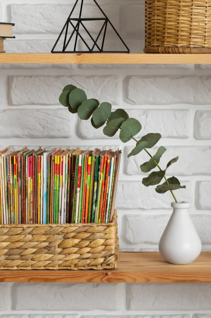
A Railroad History on a Narrow Column

A commuter transformed the five inches between a bookcase and entry door into a vertical rail chronology. Early steam-era cancellations climbed from skirting board to transom, with discreet labels explaining routes. Visitors lean in, tracing lines with eyes while shoes still on. The column feels like a track itself, pulling attention upward and beyond the small mat. It’s proof that narrative intensity, not square footage, creates wonder in everyday thresholds.

The Magnetized Wardrobe Side

A renter painted a wardrobe side panel with magnetic primer and topcoat, then mounted archival magnetic sleeves. Morning routines include rotating a featured set before work. No drilling, no landlord drama, just a quiet, evolving gallery that greets sunrise. With a clip-on LED, the panel glows after dark. Storage boxes below hold resting collections. The intimacy of dressing beside history turns ordinary chores into rituals linked to journeys, designers, and distant postmarks.

From Shoe Box to Skyward Gallery

An inherited shoebox of mixed stamps once felt overwhelming. By choosing a slim rail, three magnetic frames, and a neutral mat palette, the collector built a tiny, changing exhibit that rises beside a writing desk. Pieces rotate monthly, prompts invite friends to vote on the next set, and a modest hygrometer watches quietly. The collection finally breathes, teaching its owner gently, while the room gains vertical lift without sacrificing workspace or calm.

Bbvteknoloji
Privacy Overview

This website uses cookies so that we can provide you with the best user experience possible. Cookie information is stored in your browser and performs functions such as recognising you when you return to our website and helping our team to understand which sections of the website you find most interesting and useful.